Dreamweaver 8 Notes
Defining A Dreamweaver Site
THIS IS ONE OF THE MOST IMPORTANT ASPECT OF WEB PAGE CREATION IN DREAMWEAVER
Site planning and design
In Dreamweaver, the term site can refer either to a website or to a local storage location for the documents belonging to a website. Organizing your files in a site enables you to use Dreamweaver with FTP to upload your site to the web server, automatically track and maintain your links, manage files, and share files.
A Dreamweaver site consists of as many parts, depending on your environment and the type of website you are developing the most important are the local folder and when you are ready to publish your site to the internet the remote folder:
- Local folder is your working directory. Dreamweaver refers to this folder as your "local site."
All files associated with your site should be stored in this folder in an orderly folder structure eg all iamges should be in an images folder.
- Remote folder This is normally the folder on your web host where your files sits so it is available to the public viewing your site on the internet
Dreamweaver 8 Interface
(click on the interface image for a larger version that you can printout) 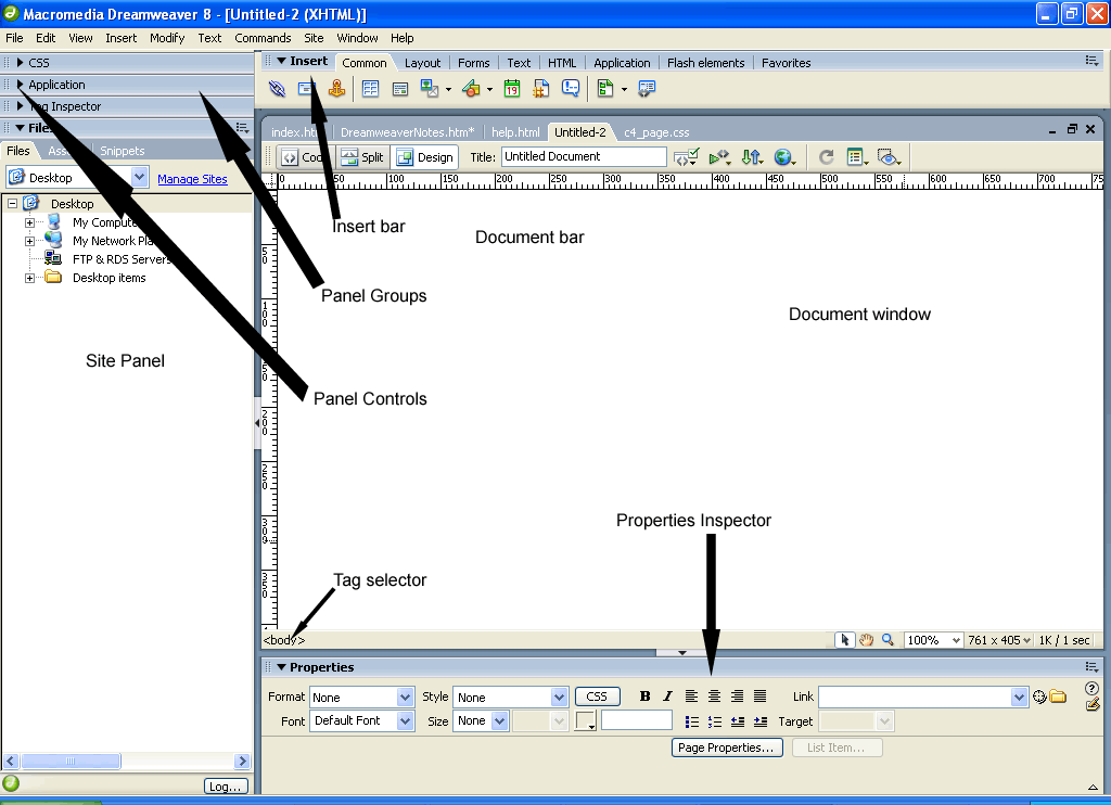
The Insert Bar contains buttons for
inserting various types of "objects," such as images, tables, and layers, into a
document. Each object is a piece of HTML code that allows you to set various
attributes as you insert it. For example, you can insert an image by clicking
the Image icon in the Insert bar. If you prefer, you can insert objects using
the Insert menu instead of the Insert bar.
The Document toolbar contains buttons and
pop-up menus that provide different views of the Document window (such as Design
view and Code view), various viewing options, and some common operations such as
previewing in a browser.
The Document window displays the current
document as you create and edit it. You can choose any of the following views:
- Design view, a design environment for
visual page layout, visual editing, and rapid application development. In this
view, Dreamweaver displays a fully editable, visual representation of the
document, similar to what you would see viewing the page in a browser. You can
configure the Design view to display dynamic content while you're working on
the document.
- Code view, a hand-coding environment for
writing and editing HTML, JavaScript, server-language code-such as Microsoft
Active Server Pages (ASP) or ColdFusion Markup Language-and any other kind of
code.
- Code and Design view allows you to see
both Code view and Design view for the same document in a single window.
To toggle quickly between the two views, press Control + tilde (~).
The Property inspector lets you view and
change a variety of properties for the selected object or text. Each kind of
object has different properties. It is context sensitive eg it will show you different properties depending on what is selected.
The Tag selector in the status bar at the
bottom of the Document window shows the hierarchy of tags surrounding the
current selection in Design view. Click any tag in the hierarchy to select that
tag and all its contents.
Panel groups are sets of related panels
grouped together under one heading. To expand a panel group, click the expander
arrow at the left of the group's name; to undock a panel group, drag the gripper
at the left edge of the group's title bar.
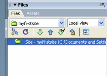
The Site panel allows you to manage the
files and folders that make up your site. It also provides a view of all the
files on your local disk, much like Windows Explorer.
Defining a site
With Dreamweaver open (Start--All programs--Macromedia--Macromedia Dreamweaver 8)
-Choose Site > New Site...
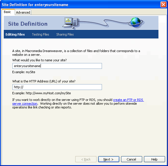
What would you like to name your site?
- Enter myfirstsite (or a meaningful name of your choice) in the site name box. You can leave the http address blank for the mean time as you may not know the http address yet.
-Click Next> |
Click Image for larger view |
Note: Dreamweaver will create your new site folder for you. Simply enter the name.
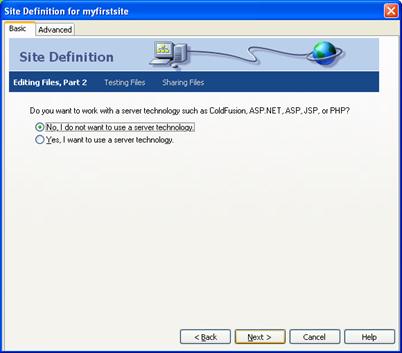
Do you want to work with a server technology such as ColdFusion, ASP.NET, ASP, JSP, or PHP?
-For us select the No radio button as we will not be using any of these technologies in this class.
-Click Next>
|
|
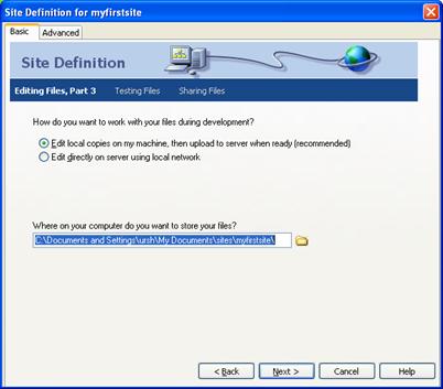
How do you want to work with your files during development?
-Select the Edit local copies on my machine... radio button.
Where on your computer do you want to store your files?
-You can enter a path and folder name manually or use the browse button to select an existing folder or to create a new one on any of your drives .
Always double check this step
-Click Next> |
|
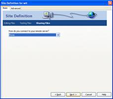
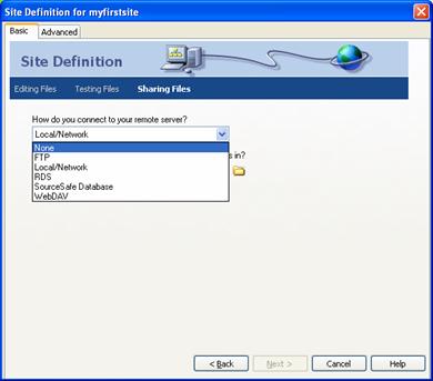
How do you connect to your remote server?
-For now, choose None.
-Click Next>
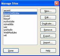
Note : When you are ready to publish your site, get the connection information from your hosting company. Edit the site by opening the Manage Site dialog, select this site, then click the Edit button. Change the setting in this screen from None to FTP and you will be able to enter the server address, login, and password to connect to your remote server.
|
|
This screen summarizes your site definition parameters.
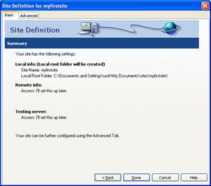
-Click Done
Your new site appears in your Files panel and is your currently selected Dreamweaver site.
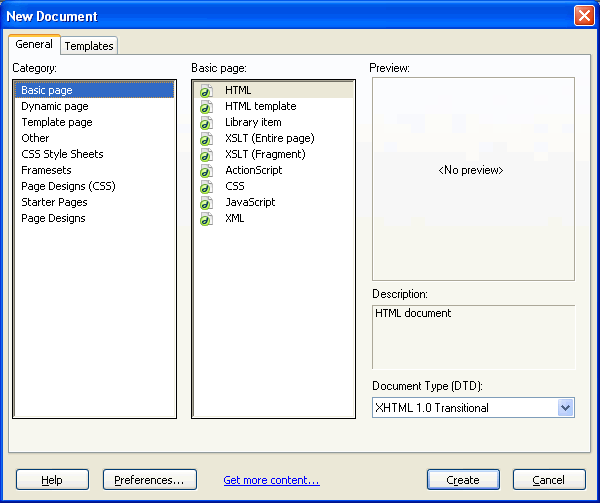
Creating a new document
-Choose File > New
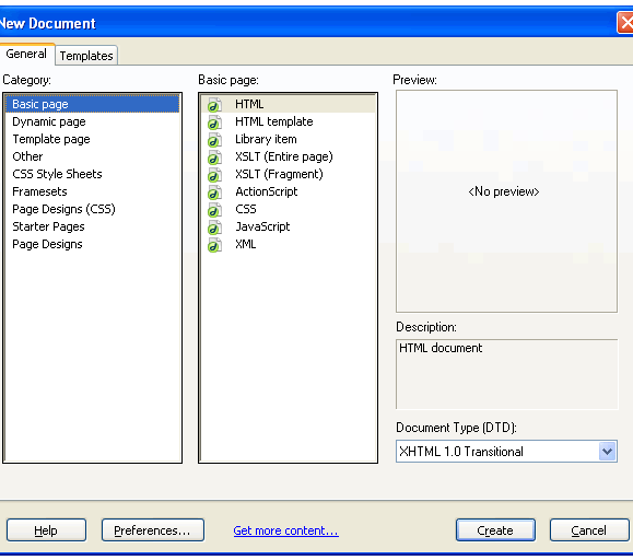
The New Document window will open.
-Select Basic page from the Category list.
-Select HTML from the Basic page list.
-Click Create |
Click image for larger view |
A new document will open, but it is not yet saved. For Dreamweaver to manage your files and assets, the file must be saved in the site.
So click File > Save and name it appropriately
Inserting & Formatting Text
Adding text to a document
There are a number of ways to add text to a Dreamweaver document. You can
type text directly in the Dreamweaver document window, or you can cut and paste
or import text from other documents.
To add text to your document, do one of the following:
- Type text directly into the Document window.
- Copy text from another application, switch to Dreamweaver, position the
insertion point in the Design view of the Document window, and choose Edit -
Paste. Dreamweaver doesn't preserve text formatting applied in the other
application, but it does preserve line breaks.
Adding space between characters
HTML only allows for one space between characters; to add additional space in
a document you must insert a non-breaking space.
You can set a preference to automatically add non-breaking spaces in a
document. To set this preference, choose Edit - Preferences and in the General
category make sure Allow Multiple Consecutive Spaces is checked.
To insert a non-breaking space, do one of the following:
- In the Insert bar, select Character, then click the Insert Non-breaking
Space icon.
- Choose Insert - Special Characters - Non-Breaking Space.
- Press Control+Shift+Spacebar.
Adding paragraph spacing
Dreamweaver works similarly to many word processing application: you press
Enter to create a new paragraph. Web browsers automatically insert a blank double line
of space between paragraphs. You can add a single line of space between
paragraphs by inserting a line break or soft return.
To add a paragraph return:
To add a line break, do one of the following:
- Press Shift+Enter.
- In the Insert bar, select Character, then click the Line Break icon.
- Choose Insert - Special Characters - Line Break.
Setting and changing fonts and styles
Use options in the Property inspector or the Text menu to set or change font
characteristics for selected text. You can set the font type, style (such as
bold or italic), and size.
When you use the Property inspector to apply bold or italic style,
Dreamweaver automatically applies the <strong> or <em> tag,
respectively.
HTML font sizes are relative, not specific, point sizes. Users set the point
size of the default font for their browsers; this is the font size that they
will see when you select Default or 3 in the Property inspector or Text - Size
submenu. Sizes 1 and 2 will appear smaller than the default font size; sizes 4
through 7 will appear larger.
To set or change font characteristics:
- Select the text. If no text is selected, the change applies to subsequent
text you type.
- Choose from the following options:
- To change the font, choose a font combination from the Property
inspector or from the Text - Font submenu.
- Choose Default to remove previously applied fonts; Default applies the
default font for the selected text (either the browser default font or the
font assigned to that tag in the CSS style sheet).
- To change the font style, click Bold or Italic in the Property
inspector, or choose a font style (Bold, Italic, Underline, and so on) from
the Text - Style submenu.
- To change the font size, choose a size (1 through 7) from the Property
inspector or from the Text - Size submenu.
- To increase or decrease the size of selected text, choose a relative
size (+ or -1 to + 4 or -3) from the Property inspector or from either the
Text - Size Change submenu.
Note: These numbers indicate a relative
difference from the basefont size. The default basefont value is 3. Thus, a
+4 value results in a font size of 3 + 4, or 7. The maximum sum for your
font size values is 7. If you try to set them higher, they display as 7.
Dreamweaver does not display the basefont tag (which goes in the head
section), although the font size should display properly in a browser. To
test this, compare text set at 3 and text set at +3
Formatting paragraphs
Use the Format pop-up menu in the Property inspector or the Text - Paragraph
Format submenu to apply the standard paragraph and heading tags.
When you apply a heading tag to a paragraph, Dreamweaver automatically adds
the next line of text as a standard paragraph. To change this setting, choose
Edit - Preferences, then in the General category, under Editing Options make
sure Switch to Plain Paragraph after Heading is unchecked.
To apply a paragraph or heading tag:
- Place the insertion point in the paragraph, or select some of the text in
the paragraph.
- Using the Text - Paragraph Format submenu or the Format pop-up menu in the
Property inspector, choose an option:
- Choose a paragraph format (for example, Heading 1, Heading 2,
Preformatted Text, and so on). The HTML tag associated with the selected
style (for example, h1 for Heading 1, h2 for Heading 2, pre for Preformatted
text, and so on) is applied to the entire paragraph.
- Choose None to remove a paragraph format.
Aligning text
You align text on the page using the Property inspector or the Text - Align
submenu. You can center any element on a page using the Text - Align - Center
command.
To align text:
- Select the text you want to align or simply insert the pointer at the
beginning of the text.
- Click an alignment option (Left, Right, or Center) in the Property
inspector, or choose Text > Align and choose an alignment command.
Note: You can align and center complete
blocks of text; you cannot align or center part of a heading or part of a
paragraph.
Indenting text
Using the Indent command applies the blockquote HTML tag to a paragraph of
text, indenting text on both sides of the page.
To indent text and remove indentation:
- Place the insertion point in the paragraph you want to indent.
- Click the Indent or Outdent button in the Property inspector, choose Text
- Indent or Outdent, or choose List - Indent or Outdent from the context
menu.
Note: You can apply multiple indents to a
paragraph. Each time you choose this command the text indents further from both
sides of the document.
Changing the text colour
You can change the color of selected text so that the new color overrides the
text color set in Page Properties. (If no text color has been set in Page
Properties, the default text color is black.)
To change the color of text:
- Select the text.
- Choose from the following options:
- Choose a color from the palette of browser-safe colors by clicking the
color picker in the Property inspector. Choose Text - Color. The system
color picker dialog box appears. Select a color and click OK.
- Enter the color name or hexadecimal number directly in the Property
inspector field.
- To define the default text color, use the Modify - Page Properties
command.
Creating bulleted and numbered lists
You can create numbered (ordered) lists, bulleted (unordered) lists, and
definition lists from existing text or from new text as you type in the Document
window. Definition lists do not use leading characters like bullet points or
numbers and are often used in glossaries or descriptions. Lists can also be
nested. Nested lists are lists that contain other lists. For example, you might
want an ordered or bulleted.
To create a new list:
- In the Dreamweaver document, place the insertion point where you want to
add a list, then do one of the following:
- Click either the Bulleted or Numbered List button in the Property
inspector.
- Choose Text - List and select the type of list desired-Unordered
(bulleted) List, Ordered (numbered) List, or Definition List. The leading
character for the specified list item appears in the document
window.
- Type the list item text, then press Enter to create another list item.
- To complete the list, press Enter twice.
To create a list using existing text:
- Select a series of paragraphs to make into a list. Click the Bulleted or
Numbered List button in the Property inspector, or choose Text > List and
select the type of list desired-Unordered List, Ordered List, or Definition
List.
To create a nested list:
- Select the list items you want to nest.
- Click the Indent button in the Property inspector, or choose Text -
Indent. Dreamweaver indents the text and creates a separate list with the
original list's HTML attributes.
- Apply a new list type or style to the indented text by following the same
procedure used above.
Inserting special characters
Certain special characters are represented in HTML by a name or a number,
referred to as an entity. HTML includes entity names for characters such as the
copyright symbol (©) the ampersand (&), and the registered-trademark symbol
(®). Each entity has both a name (such as —) and a numeric equivalent (such as
—).
Note: HTML uses the angle brackets <> in its
code, but you may need to express the special characters for greater than or
less than without Dreamweaver interpreting them as code. In this case, use >
for greater than (>) and ⁢ for less than (<).
You can insert several special characters (in the form of HTML entities) by
choosing the Characters category in the Insert bar. To insert a special
character into a document:
In the Document window, place the insertion point where you want to insert a
special character and do one of the following.
- Choose the name of the character from the Insert - Characters submenu.
- In the Insert bar, choose the Characters category and select the character
you want.
Note: There are many other special characters
available; to select one of them, choose Insert - Characters - More or select
the Insert More Characters icon in the Insert bar, select a character, then
click OK.
HyperLinks
To 'link' to another document in the same or different site, or instantly
jump to a specific location in the current document, use hypertext links.
Text links on a page are usually displayed in a color and are underlined.
Graphic links may have a colored border around them.
An HTML link consists of two parts:
- There is the text or the graphic that serves as the source or trigger for
the link. The link is activated when the text or image is clicked.
- The path to the target file or an URL if the link target is a Web
page.
To create a link to a document within your site:
- Open a Dreamweaver MX document and select a word, sentence, or even a
paragraph to use as the link.
- In the Property inspector, click the Folder icon next to the Link box then Locate the file that is the target of the link in the Select File dialog
box
- or click the point to file icon and hold the mouse down and drag it to the file you want to link to in the files panel.
- With both methods the name of the file you selected
will now appear in the Link box.
Linking to documents ont with your web site
- highlight the text or image which will act as the hyperlink and then in the link box in the property's inspector type in the full path to the page eg http://www.google.com (you must incllude the http://)
Using Images as Links
Using a graphic as the source of a link is not much different than using
text.
- In the Document window, select the graphic to be used.
- If linking to a local file, follow the same steps as when creating a text
link.
- If linking to a Web page, type the full URL of the Web page into the Link
box.
Targets
Normally, when you activate a link, the target page opens in the same browser
window you are currently in, overwriting your page with the link page.
Targets other than _blank only work when your page has frames defined.
Hotspots
You can define hotspots in an image to act as links.
For example, you might have an image that is the map of a state, with several
cities labeled on the image. You could create a hotspot for each label so the
user could view additional information about each city by clicking the city
name.
An image that has hotspots defined in it is called an image map.
- One image map may contain links to many different Web pages, to some other
graphic, or to some new location in the current document.
- You can create rectangular, circular or oval, or polygon hotspots using
tools in the Property inspector's Map text box.
- Click the Rectangular Hotspot tool in the Property inspector Map text box.
- Drag a rectangular area around the area of the image to be defined as the
hotspot.
- A translucent blue-green area with sizing handles will appear where you
dragged.
- Select the Pointer Hotspot tool and resize the box, or drag it to cover
the exact area you want defined.
- With the rectangle still selected, enter a description in the Alt text box
(optional).
- Click and drag the point to file icon next to the Link text box and drag it to the file that
is the target of the link.
- Repeat this procedure for every hotspot to be defined for the current
image map. You can mix shapes without problems, i.e. one rectangle hotspot,
one circular, one polygon, etc.
Anchors
In addition to linking to external documents or Web pages, you may want to
link to some spot in the current page.
- To do that, you must create a jump-to point in the document, which is
called a named anchor.
- After defining the named anchor, when you select the text or image as the
source for the link, you then type into the link box in the properties inspector #anchorname
To create a named anchor:
- Position the insertion point in front of the text or graphic that you want
to jump to.
- Click Named Anchor on the Common tab of the Insert bar to open the Named
Anchor dialog box.
- Enter a name for the location and click OK.
- Don't use spaces or special characters in the name.
- Named anchors are case sensitive in many browsers.
- Select the text or image in the document that is the source of the link.
In the Link text box of the Property inspector, enter the name you assigned to
the anchor preceded by a pound or number sign (#), such as #anchor1.
- When you click on the source of the link, you will jump to the named
anchor elsewhere in the document.
Tables
Create and modify a table in Standard view
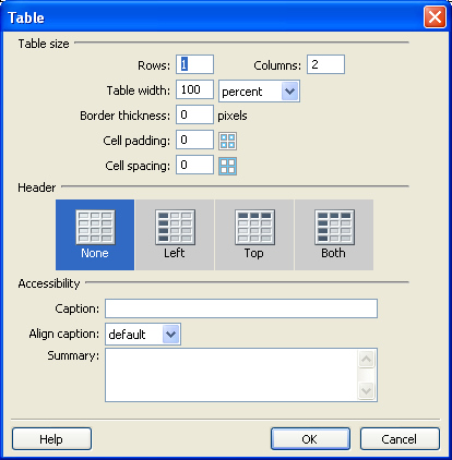
Standard view is the typical Dreamweaver design view. To create a table in
Standard view, you use the Insert Table command. Dreamweaver creates a table
based on options you select in the Insert Table dialog box. You can easily
modify the initial table structure to create more complex design by merging and
splitting cells, and by inserting rows and columns.
You use the table cells to control the placement of text and images in a web page.
Insert a table
In the Document window, place the insertion point in the document, then do
one of the following:
- Select Insert - Table.
- In the Insert bar's Common category, click the Table icon. The Insert
Table dialog box appears.
Adding and removing rows and columns
To add and remove rows and columns, use the commands in the Modify - Table
submenu. or right click within a cell and choose the table menu which appears
Note: Pressing Tab in the last cell of a table
automatically adds another row to the table.
To add rows or columns:
- Click in a cell and do one of the following:
- To add a row above the current cell, choose Modify - Table - Insert Row.
- To add a column to the left of the current cell, choose Modify - Table -
Insert Column.
- To add multiple rows or columns at once, or to add a row below the
current cell or a column to the right of it, choose Modify - Table - Insert
Rows or Columns.
- If you chose Insert Rows or Columns, enter the necessary information in
the dialog box, then click OK.
To delete a row or column:
- Click in a cell within the row or column you want to delete and do one of
the folllowing:
- To delete a row or column, choose Modify - Table - Delete Row /
Column.
Note: Alternatively, you can select a
complete row or column and then choose Edit > Clear or press Delete; the
entire row or column is removed from the table.
To add or delete rows or columns using the Property inspector:
Select the entire table and in the Property Inspector, and increase or
decrease the Rows value to add or delete rows. Dreamweaver adds and removes rows
at the bottom of the table.
Or increase or decrease the Cols value to add or delete columns. Dreamweaver
adds and removes columns at the right side of the table.
Note: Dreamweaver does not warn you if you
are deleting rows and columns that contain data.
Splitting and merging cells
Use the Property inspector or the commands in the Modify - Table submenu to
split or merge cells. You can merge any number of adjacent cells-as long as the
entire selection is a line or a rectangle of cells-to produce a single cell that
spans several columns or rows. You can split a cell into any number of rows or
columns, regardless of whether it was previously merged. Dreamweaver
automatically restructures the table (adding any necessary COLSPAN or ROWSPAN
attributes) to create the specified arrangement.
To merge two or more cells in a table:
- Select the cells. The selected cells must be contiguous and in the shape
of a rectangle.
- Choose Modify - Table - Merge Cells, or click the Merge Cells button in
the Property inspector. The contents of the individual cells are placed in the
resulting merged cell. The properties of the first cell selected are applied
to the merged cell.
To split a cell:
- Click in the cell.
- Choose Modify - Table - Split Cell, or click the Split Cell button in the
Property inspector.
- In the Split Cell dialog box, specify how to split the cell.
Add color to a table
You can add color to any part of a table. To add colour to the background:
- In the document, click in any cell of the table, then in the tag selector
located at the bottom left of the Document window, click the <table> tag
to select the entire table.
- Properties for the selected table appear in the Property inspector.
- In the Property inspector, in the Bg Color text box select a color by
doing one of the following:
- Click the color picker pop-up, then choose a color from the color
picker.
- Enter a color using a hexadecimal value, for example #CC9933.
- Enter a web-safe color name, such as yellow.
- You can apply a background color to the cells of the table the same way.
Click in the top-left cell, then in the Property inspector, select a different
color in the Bg Color text box.
Add a border color
Border color applies to both the outside and inside borders of a table.
- In the Document window, select the table.
- In the Property inspector, in the Brdr Color text box, use the color
picker to select a border color for your table.
Set a relative width table in Standard view
A percentage-based table stretches and shrinks based on the width of a
browser window. (For example if you specify that a table uses a width of 75%,
the table stretches to fill 75% of the horizontal space regardless of the
browser window size. This can be useful in some instances, such as making sure a
navigation menu is always displayed when a window is resized.
When you want to set the size of a table regardless of how a user resizes the
browser window, use pixel-based tables. When you want the table to stretch to
the size of the browser window, percentage-based tables are best.
Adding content to a table cell
You can add text and images to table cells the same way that you add text and
images outside of a table.
To move from one cell to another using the keyboard, do any of the following:
- Press Tab to move to the next cell. Pressing Tab in the last cell of a
table automatically adds another row to the table.
- Press Shift+Tab to move to the previous cell.
- Press the arrow keys to move up, down, left, or right.
Selecting table elements
You can select an entire table, row, or column at once. You can also select a
contiguous block of cells within a table.
You can also select multiple nonadjacent cells in a table and modify the
properties of those cells. You cannot copy or paste sets of nonadjacent cells.
To select an entire table, do one of the following:
- Click the upper left corner of the table or click anywhere on the right or
bottom edge.
- Click in a table cell, and then select the table tag in the tag selector
at the lower left corner of the Document window.
- Click in a table cell, and then choose Modify - Table - Select
Table.
Selection handles appear on the selected table's lower and right edges.
To select rows or columns:
- Position the pointer to point to the left edge of a row or the top edge of a
column.
- When the pointer changes to a selection arrow, click to select a row or
column, or drag to select multiple rows or columns.
To select a single cell, do one of the following:
- Click in the cell, and then select the <td> tag in the tag selector at the
lower left corner of the Document window.
- Click in the cell, and then choose Edit - Select All.
Note: Choose Edit - Select All again when a
cell is selected to select the entire table.
To select nonadjacent cells:
Control-click the cells, rows, or columns you want to select.
About conflicts in table formatting
When formatting tables in Design view, you can set properties for the entire
table or for selected rows, columns, or cells in the table. When a property,
such as background color or alignment, is set to one value for the whole table
and another value for individual cells, cell formatting takes precedence over
row formatting, which in turn takes precedence over table formatting.
The order of precedence for table formatting is:
- Cells
- Rows
- Table
For example, if you set the background color for a single cell to blue, and
then set the background color of the entire table to yellow, the blue cell does
not change to yellow, since cell formatting takes precedence over table
formatting.
Using a design scheme to format a table
Use the Format Table command to quickly apply a preset design to a table. You
can then select options to further customize the design.
Note: Only simple tables can be formatted
using preset designs. You can't use these designs to format tables that contain
merged cells (colspan or rowspan), column groups, or other unusual formatting
that keeps the table from being a simple rectangular grid of cells.
To use a preset table design:
- Select a table, and then choose Commands - Format Table. The Format Table
dialog box appears. Customize options as desired.
- Click Apply or OK to format your table with the selected design.
Setting table properties
This Property inspector allows you to set properties for tables.
To set table properties:
- Table Id is an ID for the table.
- Rows and Cols are the number of rows and
columns in the table.
- W and H are the width and height of the
table in pixels, or as a percentage of the browser window's width.
- CellPad is the number of pixels between a
cell's content and the cell boundaries.
- CellSpace is the number of pixels between
adjacent table cells. When you don't explicitly assign values for cell spacing
and cell padding, most browsers display the table as if cell padding were set
to 1 and cell spacing were set to 2. To ensure that browsers display the table
with no padding or spacing, set Cell Padding and Cell Spacing to 0.
- Align determines where the table appears,
relative to other elements in the same paragraph such as text or images. Left
aligns the table to the left of other elements (so that text in the same
paragraph wraps around the table to the right); Right aligns the table to the
right of other elements (with text wrapping around it to the left); and Center
centers the table (with text appearing above and/or below the table). Default
indicates that the browser should use its default alignment. When alignment is
set to Default, other content is not displayed next to the table. To display a
table next to other content, use Left or Right alignment.
- Border specifies the width, in pixels, of
the table's borders. Tip: When you don't explicitly assign a value for border,
most browsers display the table as if the border were set to 1. To ensure that
browsers display the table with no border, set Border to 0.
- Clear Column Widths and Clear Row Heights buttons delete all explicitly specified row height or column width values from
the table.
- Convert Table Widths to Pixels and Convert Table
Heights to Pixels buttons set the width or height of each column in the
table to its current width in pixels (also sets the width of the whole table
to its current width in pixels).
- Convert Table Widths to Percent and Convert
Table Heights to Percent buttons set the width or height of each column
in the table to its current width expressed as a percentage of the Document
window's width (also sets the width of the whole table to its current width as
a percentage of the Document window's width).
- Bg Color is the table's background color.
- Brdr Color is the color for the table's
borders.
- Bg Image is the table's background image.
Nesting tables
A nested table is a table inside a cell of another table. You can format a
nested table as you would any other table; however, its width is limited by the
width of the cell in which it appears.
To nest a table within a table cell:
- Click in a cell of the existing table.
- Choose Insert - Table.
- In the Insert Table dialog box, specify the desired properties for the
nested table, then click OK.
Images
Modern Web browsers all support graphic images in GIF or JPEG format.
GIF - Use when your image has large areas of
solid color and no color blending. GIF images are saved in 8-bit color mode,
which limits them to 256 colors.
JPEG - Use when your images are photographs
or when the image contains a large color tonal range. JPEG images are saved in
24-bit color mode and can contain millions of colors.
Both image formats are saved as compressed files, creating a small file which
downloads quickly when the page is loaded.
Dreamweaver MX allows you to choose how it will reference your images.
Document-relative referencing constructs the
path to the image based on the relative location of your HTML document to the
graphics file. Use this for hyperlinks and paths.
Site-root-relative referencing constructs
the path to the image based on the relative location of the image from your site
root. Use this for very large sites or if you will be moving pages frequently
within the server.
When you insert an image into a Dreamweaver document, Dreamweaver
automatically generates a reference to the image file in the HTML source code.
To ensure that this reference is correct, the image file must be in the current
site. If it is not in the current site, Dreamweaver asks whether you want to
copy the file into the site.
To insert an image:
- Place the insertion point where you want the image to appear in the
Document window, then do one of the following:
- In the Common category of the Insert bar, click the Image icon, drag the
Image icon to the Document window (or to the Code view window if you are
working in the code).
- Choose Insert - Image.
- Drag an image from the Assets panel (Window > Assets) to the desired
location in the Document window; then skip to step 3.
- Drag an image from the Site panel to the desired location in the
Document window; then skip to step 3.
- Drag an image from the desktop to the desired location in the Document
window; then skip to step 3.
- In the dialog box that appears, do one of the following:
- Choose File System to choose a graphic file.
- Choose Data Source to choose a dynamic image source.
- Browse to choose the image or content source you want to insert. If you
are working in an unsaved document, Dreamweaver generates a file:// reference
to the image file. When you save the document anywhere in the site,
Dreamweaver converts the reference to a document-relative path.
- In the Property inspector (Window > Properties), set properties for the
image.
Aligning an image
Use the image Property inspector to set the alignment of an image in relation
to other elements in the same paragraph or line.
Note: HTML does not provide a way to wrap
text around the contours of an image, as you can with some word processing
applications You can align an image to text, another image, a plug-in, or other
elements in the same line. You can also use the alignment buttons (left, right,
and center) to set the horizontal alignment of an image.
Default generally specifies a baseline
alignment. (The default may vary depending on the site visitor's browser.)
Baseline and Bottom align the baseline of
the text (or other element in the same paragraph) to the bottom of the selected
object.
Top aligns the top of an image to the top of
the tallest item (image or text) in the current line.
Middle aligns the middle of the image with
the baseline of the current line.
TextTop aligns the top of the image with the
top of the tallest character in the text line.
Absolute Middle aligns the middle of the
image with the middle of the text in the current line.
Absolute Bottom aligns to the bottom of the
image with the bottom of the line of text (which includes descenders, as in the
letter g).
Left places the selected image on the left
margin, wrapping text around it to the right. If left-aligned text precedes the
object on the line, it generally forces left-aligned objects to wrap to a new
line.
Right places the image on the right margin,
wrapping text around the object to the left. If right-aligned text precedes the
object on the line, it generally forces right-aligned objects to wrap to a new
line.
Resizing an image
You can visually resize elements such as images, plug-ins, Macromedia
Shockwave or Flash movies, applets, and ActiveX controls in the Design View of
the Dreamweaver Document window. Visual resizing helps you determine how an
element affects the layout at different dimensions.
Resizing changes the width and height attributes of the element back to their
original size. The W and H fields in the Property inspector display the current
width and height of the element as you resize it. The element's file size does
not change.
Flash Buttons
Flash buttons have several states that respond to actions of the mouse
pointer. To add one to your page:
- Position the insertion point where the button is to go.
- Click Flash Button on the Media tab of the Insert bar.
- Choose a button style, enter text for the button, and select a background
color.
- Assign a name for the button in the Save As text box and click OK.
- Click the Play button in the Property inspector. The button will be shown
in its original state. Click it and roll the mouse over it to see its other
states.
To resize an element:
Bitmap elements such as GIF, JPEG, and PNG images may become distorted if you
increase or decrease their width and height attributes. To maintain the same
aspect ratio, hold down the Shift key while you resize a bitmap. However, it is
recommended that you visually resize bitmaps in Dreamweaver only to determine
the layout. After you have determined the ideal size for your image, edit the
file in an image-editing application. Editing the image may also reduce its file
size and thus reduce download time.
- Select the element (for example, an image or Shockwave movie) in the
Document window. Resize handles appear at the bottom and right sides of the
element and in the bottom right corner. If resize handles don't appear, either
click away from the element you want to resize and then reselect it, or click
the appropriate tag in the tag selector to select the element.
- Resize the element by doing one of the following:
- To adjust the width of the element, drag the selection handle on the
right side.
- To adjust the height of the element, drag the bottom selection handle.
- To adjust the width and the height of the element at the same time, drag
the corner selection handle.
- To preserve the element's proportions (its width-to-height ratio) as you
adjust its dimensions, Shift-drag the corner selection
handle.
Elements can be visually resized to a minimum of 8 x 8 pixels. To adjust the
width and height of an element to a smaller size (for example, 1 x 1 pixel), use
the Property inspector to enter a numeric value.
To return a resized element to its original dimensions, in the Property
inspector, delete the values in the W and H fields, or click the Reset Size
button.
Horizontal Rules
To create a horizontal rule:
- In the Document window, place the insertion point where you want to insert
a horizontal rule.
- Do one of the following:
- Choose Insert > Horizontal Rule.
- In the Insert bar, select Common, and then click the Horizontal Rule
button.
To modify a horizontal rule:
- In the Document window, select the horizontal rule.
- Choose Window - Properties to open the Property inspector, and modify the
properties as desired.
W and H specify the width and height of the
rule in pixels or as a percentage of the page size.
Align specifies the alignment of the rule
(Default, Left, Center, or Right. This setting applies
only if the width of the rule is less than the width of the browser window.
Shading specifies whether the rule is drawn
with shading. Deselect this option to draw the rule in a solid color.
Adding Interactivity
Behaviors add interactivity to a page by enabling the user to change or
control the information they see. A behavior consists of an event (such as
clicking a mouse button) and an action (or multiple actions) that respond to the
event. Behaviors are prewritten using JavaScript code. You can specify more than
one event to trigger a behavior, and you can specify more than one action for
each event.
One common use of behaviors is to create rollover buttons. A rollover is an
image that changes appearance when the mouse pointer is moved over the button or
when it is clicked.
Creating a rollover image or button:
- Create each image the same width and height. If they are not the same
size, Dreamweaver will resize the second image to be the same size as the
first, which can cause a distorted image.
- Make the buttons as small as possible. With rollover buttons, you are
downloading two images, not one.
It is easy to add rollover behaviors using Dreamweaver Rollover Image
command.
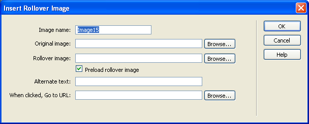
- Open your Dreamweaver document and place the insertion point where the
image is to be placed.
- Click the Insert menu-- Image Objects, then click Rollover
Image to open the dialog box.
- Assign a name to the rollover image. This name must be unique.
- Click the Browse button next to the Original Image text box and locate the
first image file.
- Click the Browse button next to the Rollover Image text box and locate the
rollover image
- After selecting both the original and the rollover image, click the
Preload Rollover Image check box to select it.
- Add descriptive text in the Alternate Text text box (optional but
recommended).
- Click the Browse button next to the When Clicked, Go To URL text box.
Locate the file to link to when the button is clicked.
- Close all dialog boxes, save, and test your file in your Web
browser.
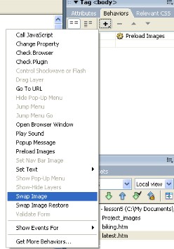
You can add behaviors to images or objects already on your page by:
- Selecting the image and assigning it a name in the Name text box of the
Property inspector.
- Clicking the Window menu and then clicking Behaviors to open the Behaviors
panel.
- Clicking the Actions button (+) and then choosing Swap Image from the pop-up
Behaviors menu.
- Clicking the Browse button and locating the rollover image file.
- Closing the dialog boxes, then saving and testing your file.
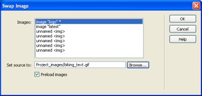
The window on the left shows the Behaviors panel and the pop-up menu that
appears when the Actions button (+) is clicked. The window on the right shows
the Swap Image dialog box. After selecting the rollover image, make sure the
Preload Images option boxes is checked.
An event is what causes an action to occur, such as the user clicking a
button or moving the pointer over an object. Events are added to the Events
pop-up menu in the Behaviors panel. The Events pop-up menu is divided into two sections:
- The top portion contains events that can be directly attached to an
object.
- The lower portion shows events that need an anchor placed around the
object.
- The Events pop-up menu appears only after you have added an action and
select the event.
Once a user event has been defined, you can attach multiple actions to it.
You can add another action by selecting the event with the first action, then
use the Behaviors panel to add another action to that event. The Behaviors panel
has arrow buttons that can be used to change the order of the actions attached
to an event. If you have a button already defined as a rollover event and action, you can
swap a second image at the same time:
- Click the second image to be swapped to select it and assign a name to it.
- Select the image that already has a behavior applied to it and
double-click the Swap Image action in the Behaviors panel.
- Select the name of the image you just assigned, click the Browse button,
and locate the image to be swapped.
- Close the dialog boxes and test your file. When you roll over the button,
the button should change and so should the second image.
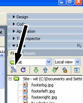
File Panel
The Site panel displays the file and folder structure of your site. You can
use the Site panel to add and delete files or folders to your site. If you use
the Site panel to maintain your site, the link information is automatically
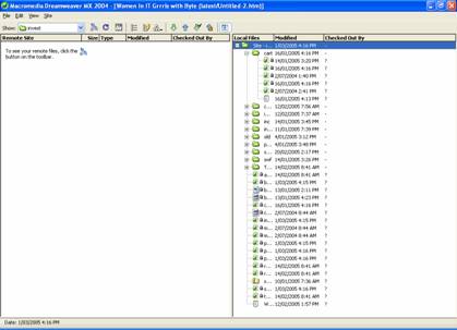
updated if you move a linked file. Depending on your platform and version of Dreamweaver, the Site panel may
open and only show the local site, or it may show two panes, one for the local
site and one for the remote site. The local site is contained on your computer and contains all the files
needed for your Web site. For anyone else to view your site, it must be copied
to a remote site on a Web server. You can simulate a remote site by creating one
on your local machine that allows you to test the Get and Put functions used to
transfer files from local to remote sites and vice versa.
- Click the Site menu and then click Edit Sites to open the Edit Sites
dialog box.
- Select your local site and click Edit.
- Click the Basic tab, then click the Next button until you reach the
sharing files section of the Site Definition Wizard.
- Select the Local/Network option and locate the folder to be used as your
remote site folder.
- When the Choose Remote Root Folder dialog box opens, click Desktop from
the Select menu, then click Create New Folder`.
- Rename the folder if desired, then select it. Click Open and then click
Select or Choose depending on the platform.
- Select the Refresh Remote File List Automatically option, then click Next
until you reach the Summary section of the wizard. Click Done.
- If using FTP or Local/Network access to the remote site, Dreamweaver can
identify the newest files on your local site and upload only those files.
- You can select any files in the local site and use the Put File(s) command
to load them from the local to the remote site.
- You can use the Get File(s) command to retrieve files from the remote site
to the local site.
Using CSS Styles
It is possible to link a file to an existing CSS style that has already been
created, or you can create your own CSS styles within a Dreamweaver document.
There are three types of CSS styles that can be created:
- Custom Style - to create a CSS style that
can be applied to selected items throughout a document, or several documents.
- Redefine HTML tags - to change the
attributes of an existing HTML tag, such as headings or links. Once the CSS
style has been redefined all the affected elements will be changed
automatically, they do not have to be selected within the documents.
- Use CSS Selector - to change the
attributes for specific elements within a CSS style. For example if you want
to change the colour of a hyperlink when the cursor is placed over it, but no
other attribute of it. Then the CSS Selector can be used to edit this
particular item.
The code for CSS styles is placed in the head tag of a HTML page. For the
Make Custom Style option, a tag is also placed around the selected text, to show
that the CSS style should only be applied to this element.
Frames
A frame is a region in a browser window that can display an HTML document
independent of what's being displayed in the rest of the browser window. A frameset is an HTML file that defines the layout and properties of a set of
frames, including the number of frames, the size and placement of the frames,
and the URL of the page to be initially displayed in each frame. The frameset
file itself doesn't contain HTML content to be displayed in a browser, except in
the noframes section, the frameset file simply provides information to the
browser about how a set of frames should be displayed and what documents should
be displayed in them. To view a set of frames in a browser, enter the URL of the frameset file; the
browser then opens the relevant documents to display in the frames. The frameset
file for a site is often named index.html, so that it displays by default if a
visitor doesn't specify a filename. In Dreamweaver, you can create a frameset in either of the following ways:
- To create a frameset with the current document displayed in one of the
frames, use the Insert bar's Frames category.
- To create a frameset with all its frames blank, use the Frameset category
in the New Document dialog box.
You can format all of your frames and framesets through the Property
inspector. You can set scrolling on or off, set width and height, name each
frame, and more.
Controlling frame content with links
To use a link in one frame to open a document in another frame, you must set
a target for the link. The target attribute of a link specifies the frame or
window in which the linked content opens. For example, if your navigation bar is
in the left frame, and you want the linked material to appear in the main
content frame on the right, you must specify the name of the main content frame
as the target for each of the navigation bar links. When a visitor clicks a
navigation link, the specified content opens in the main frame. To select a frame in which to open a file, use the Target pop-up menu in the
Property inspector. You can set a file to replace the document being displayed
in another frame, to appear in place of the entire frameset, to appear in the
frame where the link was (by not choosing a target), or to open in a new browser
window.
To target a frame:
- In Design view, select text or an object.
- In the Link field of the Property inspector, do one of the following:
- Click the folder icon and select the file to link to.
- Drag the Point to File icon to select the file to link to.
- In the Target pop-up menu, choose the frame or window in which the linked
document should appear.
- If you named your frames in the Property inspector, the frame names
appear in this menu. Select a named frame to open the linked document in
that frame.
- Note: Frame names appear only when
you're editing a document within a frameset. When you edit a document in its
own Document window, outside of the frameset, frame names do not appear in
the Target pop-up menu. If you're editing a document outside of the
frameset, you can type the target frame's name into the Target text box.
_blank opens the linked document in a
new browser window, leaving the current window untouched.
_parent opens the linked document in the
parent frameset of the frame the link appears in, replacing the entire
frameset.
_self opens the link in the current
frame, replacing the content in that frame.
_top opens the linked document in the
current browser window, replacing all frames.
Tip: If you're linking to a page outside
of your site, always use target="_top" or target="_blank" to ensure that the
page doesn't appear to be part of your site.
Setting frame Property inspector options
Use the Property inspector to name a frame and to set borders and margins.Tip: To make a link change the contents of
another frame, you must name the target frame. To make it easier to create
cross-frame links later, name each of your frames when you create it.
To specify properties for the selected frame:
- Name the frame.
Frame Name is the name used by a link's
target attribute or by a script to refer to the frame.
Note: A frame name must be a single word;
underscores (_) are allowed, but hyphens (-), periods (.), and spaces are not.
A frame name must start with a letter (as opposed to a numeral). Frame names
are case-sensitive. Don't use terms that are reserved words in JavaScript
(such as top or navigator) as frame names.
- Change the following options as desired:
Src specifies the source document to
display in the frame. Click the folder icon to browse to and select a file.
You can also open a file in a frame by placing the insertion point in the
frame and choosing File - Open in Frame.
Scroll specifies whether scroll bars
appear in the frame. Setting this option to Default doesn't set a value for
the corresponding attribute, allowing each browser to use its default value.
Most browsers default to Auto, meaning that scroll bars appear only when there
is not enough room in a browser window to display the full contents of the
current frame.
No Resize prevents visitors from dragging
the frame borders to resize the frame in a browser. (You can always resize
frames in Dreamweaver; this option applies only to visitors viewing the frames
in a browser.)
Borders shows or hides the borders of the
current frame when it's viewed in a browser. Choosing a Borders option for a
frame overrides the frameset's border settings. The options are Yes (show
borders), No (hide borders), and Default; most browsers default to showing
borders, unless the parent frameset has Borders set to No. A border is hidden
only when all frames that share the border have Borders set to No, or when the
parent frameset's Borders property is set to No and the frames sharing the
border have Borders set to Default.
Border Color sets a border color for all
of the frame's borders. This color applies to all borders that touch the
frame, and overrides the specified border color of the frameset.
Note: There is an underlying logic to
which frame borders have a given border color applied to them, but that logic
is complex; it may be difficult to understand why certain borders change color
when you specify a border color. For detailed information about the effects of
specifying border colors, see a book on frames and framesets.
- Set the following margin options if you wish (if margin options aren't
visible, click the expander arrow in the lower right corner of the Property
inspector):
Margin Width sets the width in pixels of
the left and right margins (the space between the frame borders and the
content).
Margin Height sets the height in pixels of
the top and bottom margins (the space between the frame borders and the
content).
Note: Setting the margin width and height
for a frame is not the same as setting margins in the Modify - Page Properties
dialog box.
Viewing and setting frame properties
Use the Property inspector to view and set most frame properties. To change
the background color of a frame, set the background color of the document in the
frame. To view or set frame properties:
- Select a frame by doing one of the following:
- Alt-click a frame in the Document window's Design view.
- Click a frame in the Frames panel.
- Choose Window - Properties to open the Property inspector if it isn't
already open.
- To see all of the frame properties, click the expander arrow in the lower
right corner of the Property inspector.
Templates
A Dreamweaver template is a special type of document that you use to design a
"locked" page layout. A template author designs the page layout, and creates
regions in the template that are editable in documents that are based on a
template. In a template, the designer controls which page elements a template
user- such as writers, graphic artists, or other web developers- can edit. One
of the most powerful uses of templates is the ability to update multiple pages
at once. A document that is created from a template remains connected to that
template (unless you detach the document later). You can modify a template and
immediately update the design in all document based on it. You can add a Cascading Style Sheet (CSS), timeline, or behavior to a
document that is based on a template, because Dreamweaver automatically inserts
an editable region in the head section of a document. Template-related operations (such as adding editable regions) are enabled in
both Code view and Design view. Some template customizing options are only
available in Code view. A template determines the basic structure for a document and contains
elements such as text, images, page layout, styles, and editable regions. You can create a template from a new document or from an existing document.
If you insert a template region in a document that hasn't been saved as a
template, Dreamweaver advises you that the document will automatically be saved
as a template.
To create a template:
- Open the document you want to save as a template in the Document window,
by doing one of the following:
- To open an existing document, choose File - Open and select the
document.
- To open a new blank document, choose File - New. In the dialog box that
opens, choose Basic Pages or Dynamic pages. In the document list select the
type of page you want to work with, then click Create.
- When the document opens, choose File - Save as Template.
Note: Unless you selected Don't Show This
Dialog Again, you'll receive a warning that says the document you're saving
has no editable regions. Click OK to save the document as a template, or click
Cancel to exit this dialog box without creating a template.
- In the dialog box that appears, select a site to save the template in from
the Site pop-up menu, and enter a unique name for the template in the Save As
text box.
- Click Save.
- The template file is saved in the site's Templates folder, with a .dwt filename extension.
Dreamweaver automatically locks most regions of a document when you save
the document as a template. As a template author you define which regions of a
template-based document will be editable by inserting editable regions or
editable parameters in the template. As you create the template, you can make
changes to both editable and locked regions. In a document based on the
template, however, a template user can make changes only in the editable
regions; the locked regions can't be modified.
There are four types of template regions: editable regions, repeating
regions, optional regions, and editable tag attributes.
An editable region is an unlocked region in a template-based document; a
section a template user can edit. A template author can define any area of a
template as editable.
For a template to be effective, it should contain at least one editable
region; otherwise, pages based on the template can't be edited.
Before you insert an editable region, you should save the document you are
working in as a template. If you insert an editable region in a document
rather than a template file, Dreamweaver warns you that the document will
automatically be saved as a template.
To define an editable template region:
- In the Document window, do one of the following to select the region:
- Select the text or content that you want to set as an editable region.
- Place the insertion point where you want to insert an editable
region.
- Do one of the following to insert an editable region:
- Choose Insert - Template Objects - New Editable Region.
- Right-click the selected text or object, and choose New Editable Region
from the context menu.
- In the Insert bar, select Templates, then click the Editable Region
button.
- The Editable Region dialog box appears.
- In the Name text box, enter a unique name for the region. (You cannot use
the same name for more than one editable region in a particular template.)
Note: Do not use special characters in the
Name field.
- Click OK.
The editable region is enclosed in a highlighted rectangular outline in the
template, using the highlighting color that is set in preferences.
A tab at the upper-left corner of the region shows the name of the region.
If you inserted an empty editable region in the document, the name of the
region also appears inside the region.
Removing an editable region
If you've marked a region of your template file as editable and you want to
lock it (make it noneditable) again, use the Remove Template Markup command.>Note: You can't lock a region in a file
based on a template; you can lock a region only in a template file.
To remove an editable region:
- In the document or in the tag selector, select the editable region you
want to change.
- Choose Modify - Templates - Remove Template Markup.
The region is now no longer editable.
Repeating Editable Regions
A repeating region is a section in a document that is set to repeat. For
example, you can repeat a table row. By repeating the table row, you allow the
template user to create an expanding list, while keeping the design under the
control of the template author. In a document based on the template you use
repeat region control options to add or delete copies of the repeated region.
There are two types of repeating regions you can insert in a template-repeating
region and repeating table.
To insert a repeating region in a template:
- In the Document window, do one of the following:
- Select the text or content you want to set as a repeating region.
- Place the insertion point in the document where you want to insert the
repeating region.
- Do one of the following, to create a repeating region:
- In the Name text box, enter a unique name for the template region. (You
cannot use the same name for more than one repeating region in a template.)
Note: When you name a region, do not use
special characters.
- Click OK.
The repeating region is inserted in the document.
Note: A repeating region isn't editable in
the template-based document, unless it contains an editable
region.
To insert a repeating table:
- In the Document window, place the insertion point in the document where
you want to insert the repeating table.
- Do one of the following:
- Click OK.
An optional region is a section of a
template that a designer defines as optional, to hold content such as optional
text or an image which may or may not appear in a document based on the
template. In the template-based page, the content editor usually controls
whether the content shows or notAn editable tag attribute lets you unlock a
tag attribute in a template, so the attribute can be edited in a template-based
page. For example, you can "lock" which image appears in the document but let
the page author set the alignment to left, right, or center.
Defining editable tag attributes
You use the Make Attribute Editable command to allow a template user to
modify specified tag attributes in a document created from a template. For
example, you can set a background color in the template document yet allow a
template user to set a different background color for pages they create. The
user can update only the attributes you define as editable. Creating an editable tag attribute inserts a template parameter in the code.
An initial value for the attribute is set in the template document; when a
template-based document is created, it inherits the parameter. A template user
can then edit the parameter in the document. The following data types are supported: text, boolean (true/false), color,
and URL.
Creating a template-based document
Once you set the template design, you apply a template to either a blank
document or a document that already contains content. To create a new document based on a template, you can use the Assets panel or
the New Document dialog box. The Assets panel lists templates in your current
Dreamweaver site. You can right-click in the Templates category of the Assets
panel to create a new template, and to create new documents from a template. In the New Document dialog box, you can select a template from any of your
currently defined Dreamweaver sites to create a new document from. When you
create a new document based on a template, you can choose whether the document
remains attached to the template. By default, when you change a template, all
attached documents update to reflect the template changes. If you deselect the
Update Page When Template Changes option when creating a new document, the new
document is created as stationery: an independent HTML file, with no template
regions. Updates to the template do not change the document.
To create a template-based document in the New Document dialog box:
- Choose File - New to open the New Document dialog box.
- In the New Document dialog box, select the Templates tab.
- In the Templates For list, select the site which contains the template you
want to use.
The site templates list updates to display templates in the selected site.
- In the list, select the template you want to use.
- Click Create to create a new template-based page.
The document opens in the Document window.
Editing content in a template-based page
You can easily identify and select template regions in both the template
document and in template-based documents. Editable template regions are listed
at the bottom of the Modify - Templates submenu. Editable regions that are inside a repeated region do not appear in the menu.
You must locate these regions by looking for tabbed borders in the Document
window.
To find an editable region and select it in the document:
Choose Modify - Templates, and choose the name of the region from the list at
the bottom of that submenu. The editable region is selected in the document.
Creating Libraries
Templates act as blueprints for a Dreamweaver document and work well when
pages share common items such as a logo, the header, or the copyright and 'Last
edited date' statement of the organisation. However. if these elements must be
presented at different locations and in different combinations on the Web pages
templates alone do not work. Templates represent a similar structure for all the pages of a site. In
Dreamwaever such pages can be created with the use of library items. A library
item can contain objects, such as text, images, tables and forms that can be
used across Web pages in a site. When a library item is updated it is
automatically updated in an documents containing the library item.
Library Items
The Library category of the Asset panel is used to create new library items -
Window - Assets. The library items are stored in the root folder of the site and
have a .lbi extension. To create a library item:
- Window - Assets - click on the last icon on the left hand side.
- Select the element of the document that will be a library item.
- Modify - Library - Add Object to Library to add the selected object.
- Enter a name for the library item in the bottom pane of the panel.
Inserting library items
Library items can be inserted into a site to give the site a consistent look.
To insert a library item into a document:
- Open the document in which the library item is to be inserted.
- Open the Library category of the Asset panel.
- Select the Library item that is to be inserted.
- Click the Insert button in the lower left corner of the panel to insert
the library item into the document.
Modifying library items
When a library item is modified all pages that contain the item are
automatically updated. To modify a library item:
- Select the library item from the panel.
- Click the Open Library Item button on the panel to open the Library Item
window.
- Modify the library item and save the changes in the file.
- The Update Library Items dialog box appears and asks if you want to update
all documents in the site that use this item.
- Click Update to update all the pages that use the item.
- The Update Pages dialog box appears. It shows all the updated files.
Uploading file to a webserver
You need web space!!!
- You could use the free space associated with your ISP account. To find out more check your ISP’s help pages.
- You could purchase a domain name and web hosting space. (you can not host a domain name on free space. If you purchase a domain name you do not have to purchase Web hosting you could just keep it and not use it or use just for email purposes.)
- Use free space available from a free web host.
How you get your web pages to the Internet will depend on how your web host (the site where you are going to place your web pages). Some web hosting servers will allow you to upload your files via web pages. Other hosts will require that you use an FTP program. The FTP method is the easiest. FTP stands for File Transfer Protocol and there are many free FTP programs but we are going to use Dreamweaver as our FTP program.
No matter what program you use you need to know your
FTP address
user or account name
password
Note: it is imporetant to find out what your home page is to be called on their system. It could be default.htm or index.htm or something else.
setting up FTP connections
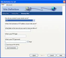
Here we will use Dreamweaver’s FTP facility.
Enter in your details- you can leave the second box “what folder on the server do you want to store your files in?” blank
Then click the Test Connection button to see if it works if it comes back with a message connected successfully then click Next and carry on as normal.
Now your FTP connection is setup.
Uploading files
When your site is finished ad you want to upload to your web host click the connect button on the files panel
Then click the Expand/Collapse button
And depending on your server and if you have already uploaded any files you should see something similar to below
Now all you need to do is drag your files from the right pane and drop them in the left and they will be transferred to your web host.
Open a browser window and type in your web address and check your site!!